

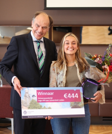
Art student Clara Lezla wins logo design competition: 444 years of Leiden University
Leiden University celebrates its 444th anniversary in 2019, and a special age requires a special logo. The logo for the celebration was designed by Clara Lezla, a student at the Royal Academy of Art The Hague.
The idea behind the logo is that Leiden University is the result of the contributions made by different people, generation after generation. Each person made their own, unique contribution. This same individuality can be seen in the handwriting of these people. This idea is given shape in 44 different logos, in which each 4 is in a different person’s handwriting.
Link to the Sweat Room
Leiden University launched a competition to develop a logo for its 444th anniversary. A group of students spent weeks working on their designs, and six finalists presented their logos to the jury. The jury was won over by the idea behind the winning logo. It also linked the interactive aspect of working with different versions of the logo, and the link to the Sweat Room, one of the best-loved spots at Leiden University.
Unique people
‘I want to add human elements to the logo,’ says Clara Lezla, winner of the design competition. ‘That is how I came up with the idea of a logo with different people’s handwriting. The logo constantly changes because it illustrates the idea of unique people in a community. Each individual can see themselves in and identify with the logo.’
The story of the University
‘I didn’t know Leiden University that well, but that meant I could look at the University with objective eyes,’ says Clara Lezla. ‘I realised that throughout history so many different famous and unknown people have graduated from Leiden University, and that more will follow in the future. For me, the logo had to symbolise the past, the present and the future. So many people with so many different cultural backgrounds came together for the same thing. The hand-written aesthetic of the logo suggests that, one by one, each person rewrites the story of the University, but then always together with others.’
Academy of Creative and Performing Arts
Leiden University and the University of the Arts The Hague, comprising the Royal Conservatoire The Hague and the Royal Academy of Art The Hague, have worked together since 2001 in the Academy of Creative and Performing Arts To design the logo Leiden University decided to make use of the creativity of the students from the Royal Academy of Art.
After several selection rounds, six finalists (see photo header) presented their design to the jury members in the Academy Building: Henk Borgdorff, Academic Director of the Academy of Creative and Performing Arts; Renée Merkx, director of the Stragic Communication and Marketing directorat (SC&M); and Marcel Villerius, web specialist at SC&M.
Text and photos: Sahra Almahmood
Mail the editor